Showing posts with label watercolor. Show all posts

Thursday, June 12, 2014

Hi all! Father's Day is only three days away!! It's crazy how these holidays always sneak up on me - it feels like it was just Mother's Day yesterday, doesn't it? If you haven't created a card for your dad yet, follow along with me today as I make a really easy and FUN card! :)


So, the first thing I did was cut out a file that I created on my Silhouette Cameo from some plain white cardstock - you can download the SVG file here. Then, simply write (Best Dad Ever) underneath so you have some personal handwriting on there!


Then, we're going to get started on our watercolor background that's going to go behind the negative space of the die cut.


Very important tip: When watercoloring, if you want to have maximum blending between colors (which is what I want for the ombre-like effect I'm trying to achieve), wet your paper FIRST before adding any color. The whole thing. Just slap it on generously. ;) You'll see a HUGE difference once you start putting on color - it will really start to blend itself. Just look at how easily the colors blend together when you do this!


So just keep going at it, using whatever colors you like. When you're all done with that, let it dry, or use a heat gun to speed up the process.


Now comes the even MORE fun part! We're going to add some more interest to this background, because the spaces under the "BDE" are quite large and we want to make it look cool behind. So we're going to do some watercolor paint splatters! :D Make sure to cover up your workspace under your card front if you care about mess. You can also practice splattering on a separate piece first if you want, but I mean, they're splatters, so they don't have to be perfect, haha.

Tip: When making paint splatters, a medium/large round tipped brush will create the best effects.
So what you're going to do is take a generous amount of water on your round brush and mix it in with the color you want to splatter with.


Flick your brush onto your paper, or hold it horizontally with one hand while tapping from the top with your other hand. If the paint isn't coming off, you can quickly dip your brush into your water and try again...


..And just keep splattering away until you like the result!


Once that's all dry, we just have to assemble the card and we're done! I decided to pop up the front die cut on foam squares because it really makes the negative space pop out. You can just adhere it flat if you don't want to deal with the backings of 20+ foam squares. ;) Then I added some wood veneer little stars to act as periods for the abbreviation of "BDE" - you can use enamel dots, sequins, or even just leave it blank. And here's another look at the final result - those paint splatter just look awesome behind the negative of the die cut!!!


Bonus: Go to Instagram (@michelleyuen_) to see the step-by-step photos in stop-motion form!!! (You'll have to be on a phone to see the video, I believe)

If you decide to recreate this card, let me know how it turns out, and leave a link/photo so I can check it out! Have fun :)

Hi all! Father's Day is only three days away!! It's crazy how these holidays always sneak up on me - it feels like it was just Mother's Day yesterday, doesn't it? If you haven't created a card for your dad yet, follow along with me today as I make a really easy and FUN card! :)


So, the first thing I did was cut out a file that I created on my Silhouette Cameo from some plain white cardstock - you can download the SVG file here. Then, simply write (Best Dad Ever) underneath so you have some personal handwriting on there!


Then, we're going to get started on our watercolor background that's going to go behind the negative space of the die cut.


Very important tip: When watercoloring, if you want to have maximum blending between colors (which is what I want for the ombre-like effect I'm trying to achieve), wet your paper FIRST before adding any color. The whole thing. Just slap it on generously. ;) You'll see a HUGE difference once you start putting on color - it will really start to blend itself. Just look at how easily the colors blend together when you do this!


So just keep going at it, using whatever colors you like. When you're all done with that, let it dry, or use a heat gun to speed up the process.


Now comes the even MORE fun part! We're going to add some more interest to this background, because the spaces under the "BDE" are quite large and we want to make it look cool behind. So we're going to do some watercolor paint splatters! :D Make sure to cover up your workspace under your card front if you care about mess. You can also practice splattering on a separate piece first if you want, but I mean, they're splatters, so they don't have to be perfect, haha.

Tip: When making paint splatters, a medium/large round tipped brush will create the best effects.
So what you're going to do is take a generous amount of water on your round brush and mix it in with the color you want to splatter with.


Flick your brush onto your paper, or hold it horizontally with one hand while tapping from the top with your other hand. If the paint isn't coming off, you can quickly dip your brush into your water and try again...


..And just keep splattering away until you like the result!


Once that's all dry, we just have to assemble the card and we're done! I decided to pop up the front die cut on foam squares because it really makes the negative space pop out. You can just adhere it flat if you don't want to deal with the backings of 20+ foam squares. ;) Then I added some wood veneer little stars to act as periods for the abbreviation of "BDE" - you can use enamel dots, sequins, or even just leave it blank. And here's another look at the final result - those paint splatter just look awesome behind the negative of the die cut!!!


Bonus: Go to Instagram (@michelleyuen_) to see the step-by-step photos in stop-motion form!!! (You'll have to be on a phone to see the video, I believe)

If you decide to recreate this card, let me know how it turns out, and leave a link/photo so I can check it out! Have fun :)

Thursday, December 12, 2013


It is getting frigid and really starting to feel like winter! Which of course means it’s the perfect time to scrapbook those autumn photos, right? ;) Why does it always feel like I’m a season behind? Oh wait, maybe because I am…

Anyway, I’m going to share TWO autumn layouts with you today! I really like how both of them came out, especially since I really love the photos!!

For the first one, I was inspired by Paige Evan’s page (by the way, she is having an amazing giveaway right now that you might want to check out) using lots of leaves.


I used sheets from the Maggie Holmes Flea Market 6x6 paper pad and cut a bunch of leaves with my Silhouette. 


You can download the SVG that I made and used here!


After they were all cut out, I positioned them around my page, making sure to spread out the leaves that had similar patterns and colors.

Then I cut out a title with my Silhouette and watercolored it to make it stand out more.

To my delight, the Freckled Fawn wood veneer frames I got in my Black Friday grab bag fit PERFECTLY around my photos – AND the words were so appropriate. Now that’s serendipity! I decided to paint them with white acrylic paint, and then also did a light wash of watercolors to make them match the title. The effect is just so subtle and beautiful!


I did the same for these LOVE wood veneer penants from Crate Paper, and dressed them up further with little chipboard stickers and more wood veneer.

After all of this, I didn’t have a good space for journaling, so I took a piece of vellum and journaled a frame around the pictures.

This ended up being one of my recent favorite layouts – I hope you like it too! :)

I used another picture from this photoshoot for my next layout, but I did a more "showcase" one, using one 4x6.


I mainly wanted to try a really cool watercolor technique that Wilna shows in Art Class 1, and I really love the beautiful, artsy, free effect you end up with!!


With such a beautiful and colorful thing to look at, I didn’t add much else to my page, and I still really like how it came out.


You might have noticed from my last few layouts that I am loving these resin flowers recently (I've almost finished with the package and need to get some more in my next Two Peas order!). Except there's a hot pink one in the package and I'm not really a fan of hot pink... but I didn't want to let such a pretty embellishment go to waste! I simply covered the flower in white acrylic paint, and while the paint was still kind of wet, i painted over it with red/pink watercolors. It's not perfect and smooth, but I definitely like it a lot better than the hot pink! Don't be afraid to alter your items to make them work for you!! :)


I hope these two layouts gave you some inspiration to scrap autumn photos, if you’re like me and hadn’t done so yet! Let me know if you try out any of these techniques!

Hope you have a great day :) xx


It is getting frigid and really starting to feel like winter! Which of course means it’s the perfect time to scrapbook those autumn photos, right? ;) Why does it always feel like I’m a season behind? Oh wait, maybe because I am…

Anyway, I’m going to share TWO autumn layouts with you today! I really like how both of them came out, especially since I really love the photos!!

For the first one, I was inspired by Paige Evan’s page (by the way, she is having an amazing giveaway right now that you might want to check out) using lots of leaves.


I used sheets from the Maggie Holmes Flea Market 6x6 paper pad and cut a bunch of leaves with my Silhouette. 


You can download the SVG that I made and used here!


After they were all cut out, I positioned them around my page, making sure to spread out the leaves that had similar patterns and colors.

Then I cut out a title with my Silhouette and watercolored it to make it stand out more.

To my delight, the Freckled Fawn wood veneer frames I got in my Black Friday grab bag fit PERFECTLY around my photos – AND the words were so appropriate. Now that’s serendipity! I decided to paint them with white acrylic paint, and then also did a light wash of watercolors to make them match the title. The effect is just so subtle and beautiful!


I did the same for these LOVE wood veneer penants from Crate Paper, and dressed them up further with little chipboard stickers and more wood veneer.

After all of this, I didn’t have a good space for journaling, so I took a piece of vellum and journaled a frame around the pictures.

This ended up being one of my recent favorite layouts – I hope you like it too! :)

I used another picture from this photoshoot for my next layout, but I did a more "showcase" one, using one 4x6.


I mainly wanted to try a really cool watercolor technique that Wilna shows in Art Class 1, and I really love the beautiful, artsy, free effect you end up with!!


With such a beautiful and colorful thing to look at, I didn’t add much else to my page, and I still really like how it came out.


You might have noticed from my last few layouts that I am loving these resin flowers recently (I've almost finished with the package and need to get some more in my next Two Peas order!). Except there's a hot pink one in the package and I'm not really a fan of hot pink... but I didn't want to let such a pretty embellishment go to waste! I simply covered the flower in white acrylic paint, and while the paint was still kind of wet, i painted over it with red/pink watercolors. It's not perfect and smooth, but I definitely like it a lot better than the hot pink! Don't be afraid to alter your items to make them work for you!! :)


I hope these two layouts gave you some inspiration to scrap autumn photos, if you’re like me and hadn’t done so yet! Let me know if you try out any of these techniques!

Hope you have a great day :) xx

Monday, September 16, 2013

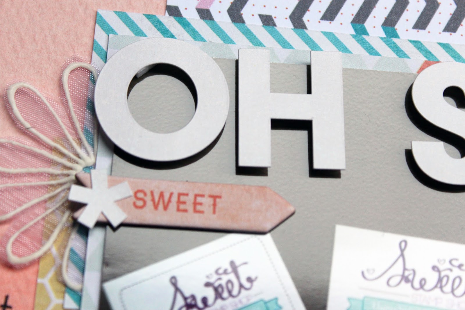
Yesterday was a new reveal over at Use Your Words, where the word was "sweet" - you'll have to excuse my tardiness for this post, as it was my birthday weekend and it must have completely slipped my mind in the excitement and celebrations haha..

Anyway, this word came with such PERFECT timing, as I've just recently become a member of the Sweet Stamp Shop Design Team - what a coincidence, right?? I'm absolutely loving working in that group of awesome people and designers, so I thought this was the perfect opportunity to document this!! Here is the layout I made:


My favorite part of making this layout was the watercolor background -  I tried my hand at doing an ombre background, and I have to say, I think it came out pretty good! There are so many papers like this out now, but I thought it would be fun to try making the effect myself! I'll definitely be trying this technique out with other colors in the future. Then I had fun just layering scraps of papers together :)

Be sure to check out the full post at the Use Your Words blog, where you'll see inspiration from all the other DT members. And you STILL have a chance to win the exclusive September printable, designed by me!! Make sure you link up at the UYW blog with a layout using one of the challenge words, and you'll be entered to win :)

Thanks for stopping by today - hope you have a great week!!

Yesterday was a new reveal over at Use Your Words, where the word was "sweet" - you'll have to excuse my tardiness for this post, as it was my birthday weekend and it must have completely slipped my mind in the excitement and celebrations haha..

Anyway, this word came with such PERFECT timing, as I've just recently become a member of the Sweet Stamp Shop Design Team - what a coincidence, right?? I'm absolutely loving working in that group of awesome people and designers, so I thought this was the perfect opportunity to document this!! Here is the layout I made:


My favorite part of making this layout was the watercolor background -  I tried my hand at doing an ombre background, and I have to say, I think it came out pretty good! There are so many papers like this out now, but I thought it would be fun to try making the effect myself! I'll definitely be trying this technique out with other colors in the future. Then I had fun just layering scraps of papers together :)

Be sure to check out the full post at the Use Your Words blog, where you'll see inspiration from all the other DT members. And you STILL have a chance to win the exclusive September printable, designed by me!! Make sure you link up at the UYW blog with a layout using one of the challenge words, and you'll be entered to win :)

Thanks for stopping by today - hope you have a great week!!